When someone says the word “apple,” the fruit isn’t the only thing that comes to mind. You can’t help but see the tech giant’s iconic logo as well, and it’s all because of the masterful Apple branding.
The logo has a strong case for being the most recognizable one in the world. It’s everywhere, from phones down to watches. No matter where you are in the world, you just can’t escape it—that’s how massive Apple is.
Apple branding is in its own league. For a company with a simple logo, they’ve amassed legions of fans and devoted consumers worldwide. You have to wonder: how did they get to the top of the pack and stay there without seemingly missing a beat?
It’s safe to say that Apple’s branding history is a long one. Fun fact: its current logo hasn’t always looked like its present self. Its typefaces have their fair share of makeovers as well. The brand’s identity has come a long way since its humble beginnings in the 70s.
With that said, let’s take a field trip and recount its rise to branding prominence.
1976: A Brand Is Born
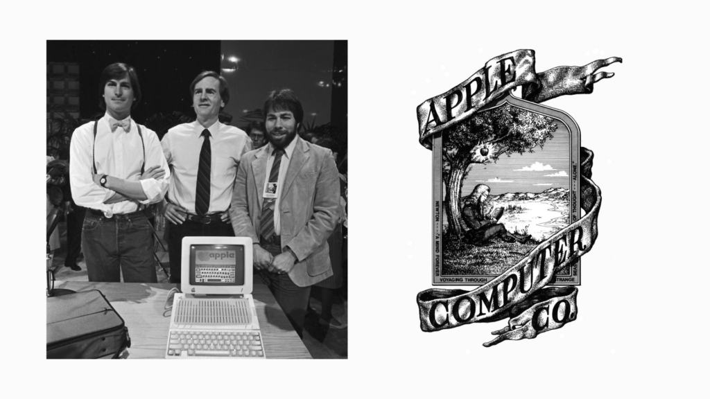
Apple’s story began in Los Altos, California, in 1976. Steve Wozniak, Ronald Wayne, and the late Steve Jobs were in the latter’s childhood home when they decided to sell personal computers Wozniak built himself. Thus, Apple was born. The brand’s logo followed not long after.
Apple’s first logo was created by none other than Wayne himself. It depicted Isaac Newton sitting under a tree, unaware that an apple’s about to fall on his head, leading him to discover gravity. Wayne also weaved a William Woodsworth quote on the legendary scientist into the frame.
Unfortunately, this logo didn’t last long. Jobs believed that Apple’s first logo was too old-fashioned and found it difficult to reproduce because of its size. Imagine trying to fit that on small products!
1977-1996: One Bite And A Rainbow
Jobs wanted to try new concepts to reflect the computers’ modernity. He enlisted the help of graphic designer Rob Janoff to create something special. Janoff was a force behind the formation of Intel’s, Compaq’s, and America Online’s brand identities, so Jobs knew what he was doing when he invited him to help with Apple’s new logo.
Janoff’s hiring then led to the creation of the now-iconic bitten apple.
The color scheme was a nod to the Apple II—the world’s first color display computer. It made its debut a little before the model’s launch. According to Janoff, the color placement wasn’t strategic; he noted that Jobs wanted the green to come first since it was where the leaf was located. With that said, the design immediately got Jobs’s seal of approval.
Have you ever wondered why the Apple logo has a bite? Janoff did it so people can tell that it resembled an actual apple and not a cherry tomato. It was also a play on bite/byte—pretty fitting for a tech business, don’t you think?
Typeface Decisions
During this period, Apple used the Motter Tektura typeface to accompany the logo. As the years went on, the company made changes to the type to make it more stylish.
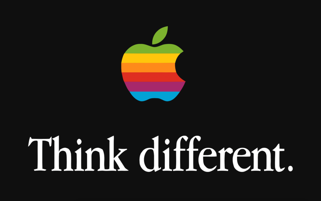
In 1984, Apple swapped Motter Tektura for their customized version of the Garamond. The brand famously used it in the company’s “Think Different” campaign, as seen above. During this time, they began displaying the logo by itself, along with the now-iconic tagline.
The rainbow logo remained essentially unchanged during Jobs’s long exit from the company. However, the Apple Garamond was thrown out in favor of Gill Sans.
Like most things, this logo variation, unfortunately, didn’t last forever. The rainbow logo had a long run for 22 years before it was retired.
Recommended reading: Epic Branding Fails And What We Can Learn From Them
1997: Going Monochrome
Once again, a logo change was in order a year after Jobs’s return to Apple in 1997 after his ouster back in 1985. It wasn’t commissioned just for the sake of it. Apple was hitting rock bottom, with money bleeding at dangerous levels. Jobs realized that the company could turn the tides in its favor by using the logo to its advantage.
Since the logo was a recognizable icon at this point, why not take advantage of that fact?
In 1997, the Apple logo underwent a huge change. The company shed the rainbows and went with solid white in their advertising. This first appeared on the PowerBook G3’s lid.

Logo Placement
Some Apple employees wondered why Apple’s logos appeared upside down when users opened their laptops’ lids. The answer? Jobs preferred it that way. He wanted the logo to face the users when they sat down in front of their closed laptops; he cared very little about onlookers’ observations.
Jobs also believed that the placement was a big deal because his design team noticed that people usually tried to open their laptops from the wrong end. Since he was an avid believer in a user-friendly experience, he wanted his products to be as convenient as possible.
A few years later, however, Jobs reversed his stance on the logo placement and turned it around. Former Apple employee Joe Morena had this to say about his decision:
Opening a laptop from the wrong end is a self-correcting problem that only lasts for a few seconds. However, viewing the upside-down logo is a problem that lasts indefinitely.
Joe Morena, on the logo placement
Ken Segall, an advertising director who often worked on Apple branding, had this take on the logo placement:
Which was more important: to make the logo look right to the owner before the PowerBook was opened, or to have it look right to the rest of the world when the machine was in use? Look around today, and the answer is pretty obvious. Every laptop on earth has a logo that’s right side up when the machine is opened. Back then, it wasn’t so obvious—probably because laptops were not yet ubiquitous.
Looking back, it borders on the unbelievable that something so wrong could ever have seemed right. That Steve Jobs ever wrestled with this decision only proves one thing: being right in retrospect is much easier than being right in real-time.
Ken Segall, on the logo placement
1998: A Colorful Affair
What better way to unveil a new logo than through a new product? Apple traded the rainbow for a monochromatic approach with the first iMac launch in 1998, which came in Bondi blue and other shades. The company bade goodbye to the Gill Sans typeface, introducing the Myriad font.
The iMac was a hit among fans and the general public, kickstarting Apple’s path to its current success. Imagine how the first iMac would look if they kept the rainbow logo—weird, right? It only goes to show how important it is for businesses to adjust their branding to fit their philosophy.
2007: A New Kind Of Chrome
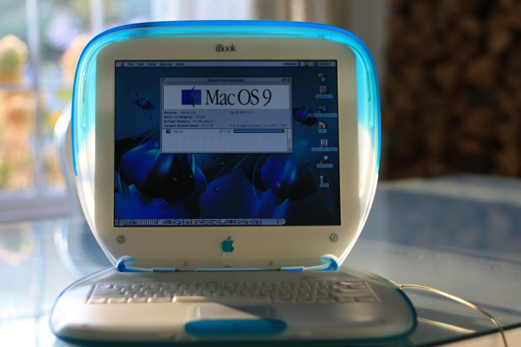
Although sales were taking off, Apple’s branding entered an awkward stage. PowerBooks, iPods, Mac minis, brochures, and software packages had the monochrome logo. Meanwhile, the iMacs versions’ were more colorful and translucent. On top of that, Mac OS 8 (the operating system at that time) continued using the old rainbow logo.
How did Apple bridge flat and flashy together? The answer came in the form of a chrome logo introduced in 2007. Apple used it on their website, printed materials, advertising campaigns, and iOS boot-ups and shutdowns. This change paved the way for a more uniform appearance across their products.
2013-Present: Hey, 2D!
Apple branding started to veer away from 3D designs and adopt a 2D approach. This switch meant saying hello to flat designs. With 3D out of the way, the monochrome logo became the primary icon once again. This time around, it’s used in every product—from the computers down to the stores. The change came at a perfect time: flat design (which isn’t a new concept, by the way) started gaining popularity during this period.
If the design aesthetics changed, so did the typography. The release of the iWatch in 2015 used the San Fransico typeface, which eventually became the signature font for all Apple products.

What Makes Apple’s Branding So Effective?
As seen, the Apple branding game is powerful. Since it’s very recognizable and ubiquitous, it’s safe to say that they won’t change things anytime soon.
How does a brand like Apple stay on top of its game? If you want to pull off something similar, sit down and take some notes. We’ve dissected some qualities that make their strategies effective:
1. Simplicity
People can get overwhelmed when you feed them too much information. Apple knows this and takes it to great heights by making simplicity one of its core philosophies. They mastered minimalism before it became trendy.
You’ll notice that there isn’t a lot going on in Apple advertisements. They don’t use Jedi mind tricks to convince customers to buy their products; instead, they just let their devices speak for themselves. Letting their devices take the spotlight is already a statement in itself.
Adopt this strategy for your brand by writing straightforward copies and using minimal graphics. Avoid using jargon to prevent confusion and ambiguity. You’ll be surprised at how this simple strategy can work like a charm.
2. Experience

Steve Jobs was a man who always wanted his products to be as fuss-free as possible. Apple has mastered that ambition, making every release feel like a part of an ecosystem that can improve daily living. It helps that their products look sleek and stylish too!
Apple doesn’t end delivering their experience at their products. They’ve also built the infrastructure to back that up. The most evident example of selling this experience is in their stores. You’ll notice how their displays won’t make customers feel like they’re gadget shopping; instead, they’re aiming to sell the experience the products will consistently give. And more often than not, Apple delivers on its promises.
This strategy created a customer experience that other brands haven’t been able to replicate. Follow this path for your brand by building an experience that keeps customers and clients coming back for more.
3. Storytelling
Since Apple already has the products and the experience, the next natural course of action is to tell their stories.
Did we mention that Apple is a master of this art?
Unlike with most tech brands, Apple branding always starts with the “why” part of their story. They jump into why their products exist and convince customers why they should pay attention. They brush the “what” off since it’s an uninspiring way to go about storytelling. By beginning with the “why,” Apple builds mystery and intrigue that catches their customers hook, line, and sinker.
As a company that prides itself on thinking outside the box, it’s no surprise that Apple goes in a different direction.
4. Emotion

Emotions are powerful things. Every brand should not forget this basic fact.
Apple branding is aware that we’re all social beings who want to be a part of something important—in this case, it’s a cultural and technical revolution. They intentionally market their releases in a manner that gets people going and talking. Just look at the buzz surrounding their release events! Regardless if people like the product or not, Apple always makes people react.
Their advertisements don’t focus much on features such as battery life. They usually showcase people having a great time with their products, which can leave customers curious.
Use human emotions to your advantage by dabbling in some emotional marketing. You don’t have to pull fancy stunts. Just use your message/philosophy as a driving point.
5. Consistency
A brand like Apple knows well not to rest on its laurels. For all the talk they do about being innovative, they’ve indeed lived up to that.
They’ve got plans upon plans for their future. Not only does this keep their brand name up in rankings, but it also brings growth and progress, which, honestly, is a win for everyone. Stagnation is the last thing that Apple wants to happen. The brand keeps up with the times while being ahead of the curve by reinforcing its core identity in every new release.
Brand power is a fickle thing. Apple branding has remained a powerhouse through the years living up to its own set of standards. Take a few cues out of their branding playbook and add them to your game! You’ll be surprised at the results you’ll get.