Just like any person, companies and brands make mistakes, too. These branding fails can often be a way for companies to reassess their branding, and it also provides a unique opportunity for us to study those failures and learn something from them.
Branding is a significant part of any company’s success or failure, and establishing a brand requires a lot of effort, skill, and knowledge of the market. You need to think about your missions and visions, the language we use to communicate, and even the people you’re talking to with your brand. Ultimately, however, it pays off to have a sound brand, especially if we’re in it for the long haul.
Tell me “why?”
When planning to build or rebuild a brand, the most critical question is “why?” to avoid branding fails.
“Why am I building this brand?”
or “Why should I rebrand?”
or,“Why do I need to spend much of my time and effort on this brand?”
Asking “why” allows you to find your brand’s purpose. It is the first question to ask the moment an idea sparks, and it’s the same question that runs throughout the journey of building your brand as a whole.
Building a brand is one thing, and choosing to rebrand is also another thing— either way, asking the question “why” is still essential.
Pinpoint on why there is a decision to rebrand. Is it a complete rebrand with a different core and purpose? Is it to refine the brand’s identity? Or is it to simply gain attraction that’s enough to resurface on everyone’s radar.
In the long run, once all these questions have been answered, building or rebuilding your brand will be less challenging and will help to avoid branding fails.

Avoiding branding fails: 6 case studies
Many points should be considered when building a brand or deciding to rebrand. To further help pinpoint your brand’s whys and avoid branding fails, here are some factors for consideration.
Brand identity
Brand identity refers to the visual elements of your brand. Logos, colors, design all fall under brand identity in which its main purpose is to create a distinguished look in the consumer’s mind.
Mastercard vs Tropicana: Same objective, very different outcomes
An example of a great brand identity is Mastercard. Mastercard Incorporated is an American multinational financial services headquartered in New York City.
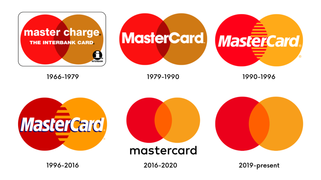
One can see how well the brand has carried its identity through its logo history. Mastercard started their logo with two intersecting circles in their iconic orange and red colors with the brand’s name written over it.
Through time, as the brand has become synonymous with finance, the logo has evolved into something simpler to keep it on-trend. As of the present, their logo has omitted their brand’s name and has only kept its iconic shapes and colors.
On the other hand, an example of a branding fail is Tropicana’s in 2009. Tropicana’s brand identity is its iconic orange fruit on its packaging to signify freshly made fruit juice.
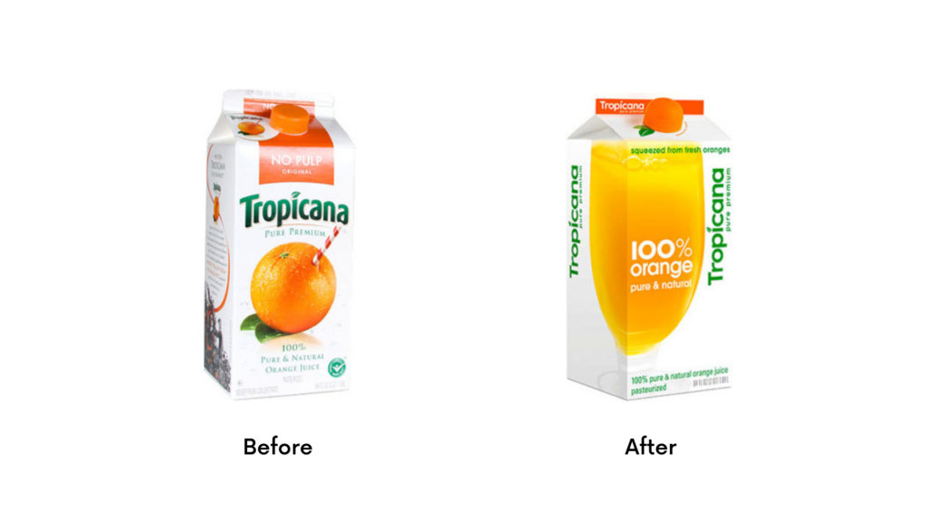
The complete and total redesign of its packaging was met with a loss of 20% in sales and suffered losing its brand identity. We can see why. The original packaging shows clearly how their product comes from fresh fruit, shown in the straw stuck directly into an orange. In the new packaging, the juice sits in a glass, and though it says “100% orange”, it no longer has a direct link to its source. This difference in packaging directly caused a lot of confusion among its consumers.
A month after the negative response to the redesign, Tropicana reverted to its original packaging.
Always ensure and solidify your brand’s identity before jumping to change and redesign everything to avoid branding fails like Tropicana’s in 2009.
Recommended: How to Choose the Right B2B Company Logo
Emotional Bond
Redesigning a brand’s identity can be beneficial if done right. If not, it’s a total branding fail. Some brands suffer terrible branding fails because of unnecessary and complete brand redesigns. Brands that fail at acknowledging their consumer’s emotional bond to their identity are usually the traditional brands that have been around for decades.
Gap’s mistake
Take, for example, Gap’s logo redesign. Gap is an American worldwide clothing and accessories retailer that has kept the same iconic logo since 1986. But in 2010, the logo was redesigned, and it was an epic brand fail.
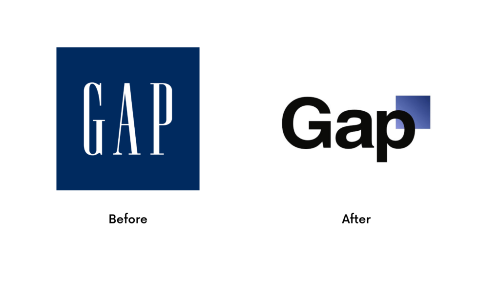
A lot of the backlash that ensued from this example lies in what is called the consumer’s emotional bond to a brand’s identity. As stated by Gap itself, the original logo has been around for 20 or so years, so they decided to revamp it.
The issue that sprung is how they changed too many elements on the logo, which so many people equated with their childhood wearing Gap hoodies and sweaters. On top of this, Gap also decided on this change without sufficient explanation to answer “why.” They were selling the same line of items, the website looked the same, the store’s interior stayed the same, and the only difference was the logo.
Overall, this branding fails caused a lot of confusion among its most loyal consumers.
Needless to say, with the backlash, a significant dip in sales, and Gap’s already collapsing brand, they decided to revert to the original in less than a week. As they say, if it isn’t broken, why fix it? If people love and idolize your logo, why start from scratch?
Tradition and History
When considering rebranding or revamping the brand identity, it’s crucial to consider your brand’s tradition and history. In recent years, saying goodbye to classic and iconic logos from timeless brands and redesigning it into cleaner and more minimalist looks has been the trend. Unfortunately, not all classic brands need to be revamped because of their history and tradition.
Two football clubs
Let’s take, for example, Cardiff City Football Club’s and Leeds United’s team logos. Both fall under the sports team categories but are still considered to have branding fails due to their logo redesigns.
Leeds United Football Club is an English professional football club based in the city of Leeds, West Yorkshire. In England, practically every official football team crest has a classic and historical design, which only goes through slight design changes every few years to refine it.
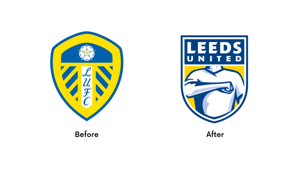
Changing this meaningful crest into a completely new look for the sake of keeping up with the modern trend erases a team’s rich history entirely.
At the very least, Leeds United only modified its current logo and kept the same team color, thus being able to escape a lot of scrutinies. It’s nowhere near the disaster of a branding fail that Cardiff City FC made with their redesign.
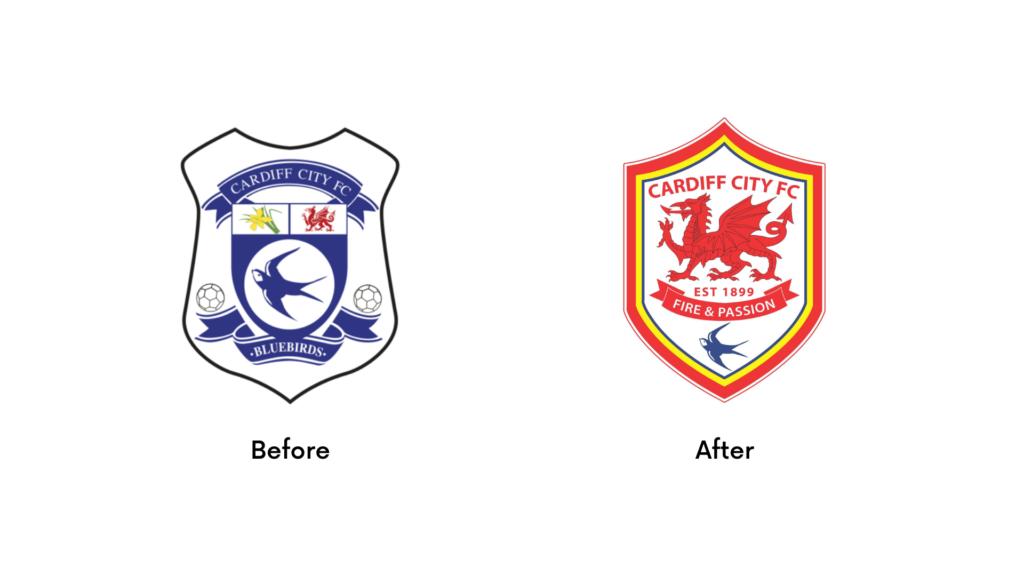
With this example, you can see that they not only redesigned their logo entirely, but they also changed the team’s color and the mascot featured on their crest. This drove the fans of the football team into mayhem and utter disappointment.
When it comes to sports, fans are emotionally bonded to colors and mascots. In short, erasing all of this erases supporters as well. It’s the perfect example of a brand that failed to acknowledge its long tradition and history.
Animal Planet
Of course, we can also see this branding mistake outside of the sports world. Take Animal Planet’s logo redesign as an example.
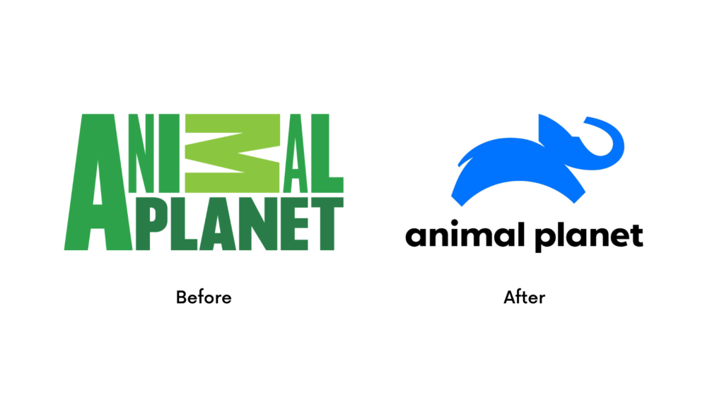
Animal Planet has the envious position of being an iconic brand. It has a brand identity history of having an elephant as its mascot and tied in with a green color scheme and unique typography that anyone can instantly recognize. In 2018, they redesigned the logo to have a modern and minimalist look.
Unfortunately for them, it only confused its viewers since it omitted its green color scheme and the iconic typography. Although the rebranding represents youth, loyalty, and progressiveness, the classic look that created much nostalgia has been sacrificed.
History and tradition in branding play a big role in the consumer’s perspectives. One must always consider these when planning to rebrand in order to avoid failure.
Originality
Building a new brand or deciding to give your brand a new look always takes a lot of creativity to develop something original. In this industry, originality matters because one of the worst kinds of branding failure is having a similar brand identity with another brand.
Lucky are those brands that end up with just a few stains on their name. But some issues like these can turn for the worse and even bring in lawsuits, copyright issues, or a dip in sales.
Airbnb vs Sears
One example of brands having oddly similar logos is Sears and Airbnb. In 2019, Sears, an American chain of department stores, decided to give its brand a new look.
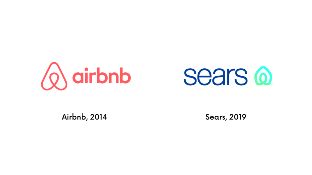
The concept was to “represent both home and heart; this shape also conveys motion through an infinity loop, reminiscent of one embracing both home and life.” The new logo definitely stayed true to its concept of being more family-friendly with the longevity that their products bring.
The only issue is that it looked oddly similar to Airbnb’s logo. Airbnb, of course, also has the same concept of homes and lives. Thankfully, Airbnb did not comment at the time. And in 2020, Sears revealed a new logo to distance their brand from Airbnb further.
Sometimes brands would claim that it’s just a simple coincidence, but many consumers highly doubt it. Lacking originality and plagiarism are unacceptable in any creative industry. Be original and fact-check your brand’s look. Each element in your brand’s identity should be original to avoid branding fails.
There are many other ways a brand can fail. However, the fear of failure shouldn’t debilitate our drive to establish a new brand or redesign an existing one. While there is no one-size-fits-all guide for branding, one tip has never failed those who have endeavored to start their own business and organization.
That is, take your time.
By not rushing, we’re able to take stock of every single element that makes up our brand, from goals to target audience to design representations. Consulting with branding professionals is also an excellent way of gauging if we’re on the right track.
For an easier way to brand yourself, check out TemplateMonkey’s collection of high-quality templates. They’re easy to use, accessible, and designed by some of the best in the world.